The Very Best 100 Christian Album Covers of the 2010's
As both an avid fan and consumer of Christian music and its subsequent creative art, I thought it appropriate to take it upon myself to compile an era-defining list chronicling the best of Contemporary Christian Music (CCM) album artwork for the decade 2010-2019.
We’re finishing off completely different than we began, most notably with the rise of modern worship from 2010-2013. Thanks in part to the popularity of Hillsong’s “Oceans” and its staying power on CCM radio, worship returned to the front lines of the CCM industry with entire radio stations transitioning formats from CCM to solely Praise and Worship music.
With that global transition, the creative trend was to match the intimacy, beauty and power of worship reflected in those respective singles’ and albums’ artwork. What transpired was an increase in hand-made artwork, with a mid-10s global spike in hand lettering — something now synonymous with Christianity - even in the mainstream music industry.
As we close the 10s and open the 20s, the cutting edge trends within design and specifically album artwork have come to embrace the early 2000s in all their weirdness. Trending are stretched fonts (and bad fonts for that matter), blurry imagery, wide angle lenses (thanks iPhone), bold colors, and a decided nod to the 70s as well.
As a 7 year old in 1999, I’m here for this millennium-embrace as it gives me the chance to do it again…but do it right.
So here’s to the 2010s; we salute your hand lettering, your Gotham-In-A-Box titles, wide-kerned-everything, and duotoned imagery. Here’s to the 20s and learning to adapt to an ever-changing social-media/phone focused art form.
*A couple of things to note: as the Art Director for Bethel Music, I’ve not included any album covers that I designed — self explanatory. This list is based on album cover design solely — I’m not ranking the music of these albums — I’ll leave that to Billboard and Rolling Stone. Finally, my criteria for this list was: album released between Jan 1, 2010 and Dec 31, 2019 and within the GMA-CCM genre and listed on JesusFreakHideout.com
100 covers from 2010-2019 were chosen with one named “best” from each year. Covers are grouped together then the best cover is listed at the end.
2010
“Dark Is The Way, Light Is A Place” by Anberlin
“A Beautiful Exchange” by Hillsong Worship
“Flags” by Brooke Fraser
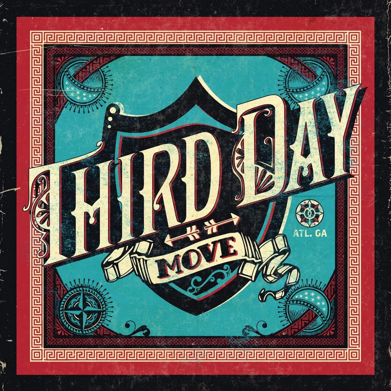
“Move” by ThirdDay
“Disappearing World” by Fair
“Suburba” by House of Heroes
“The Changing of the Guard” by Starflyer 59
“Yahweh” by Hillsong Chapel
“God Be Praised” by Gateway Worship
In classic Christian form, 2 years behind the 2008 Obama campaign, 2010 was full of bold sans-serif font choices (Gotham and Futura) paired with hand made graphics and realistic illustrations. Starflyer and ThirdDay enjoyed album art that harkened back to a bygone era, while Hillsong was ever the trendsetter with their hand-lettered “Yahweh” and triangles-aren’t-from-the-devil “A Beautiful Exchange” which churches around the globe went wild for and emulated everywhere for years to come. Fraser and Fair kept it classic with photo-driven covers paired with bold type — also iconic to 2010. Anberlin rounded out the year with a beautiful art piece years ahead of it’s time, while House of Heroes and Gateway had us reaching for the block-letter-clipping-masks in Photoshop — it was just so cool!
2010 WINNER: “Yahweh” by Hillsong Chapel
Ordinarily I wouldn’t have voted this cover given it’s strong competition, except for it’s unsuspecting power-house ability to completely re-direct CCM design trends for an entire decade by simultaneously introducing and cementing hand-lettering as the new go-to type choice for the majority of the 2010s.
Creative Direction: Jay Argaet // Design: Nathan Johnson of Blacklist Studio
2011
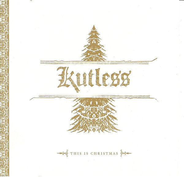
“This Is Christmas” by Kutless
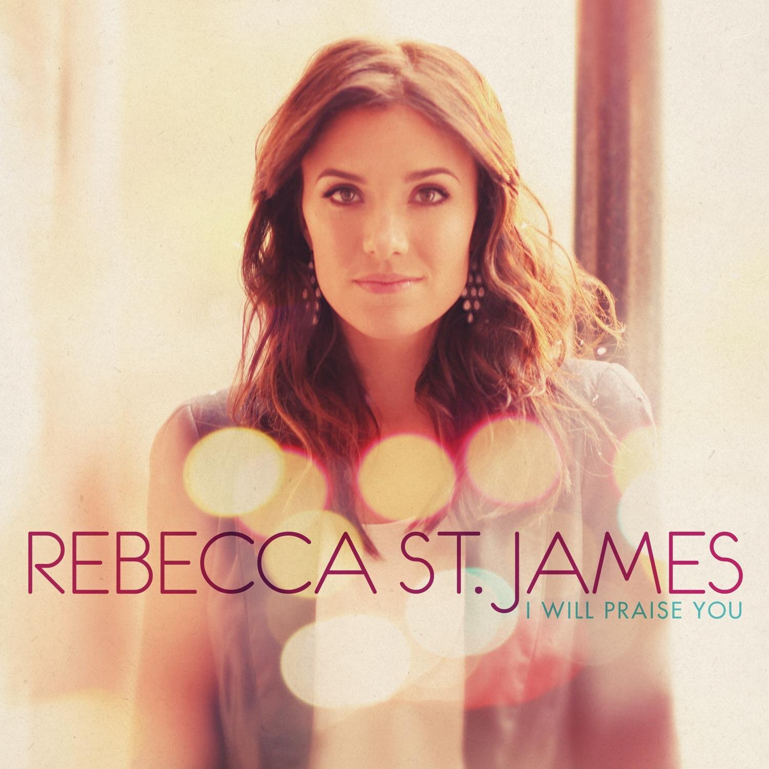
“I Will Praise You” by Rebecca St. James
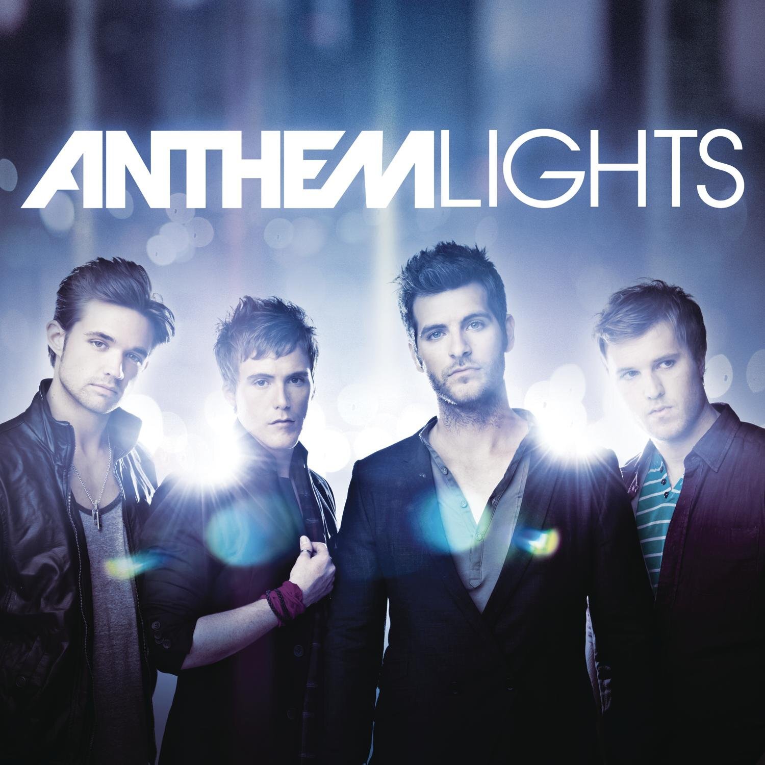
“Anthem Lights” by Anthem Lights
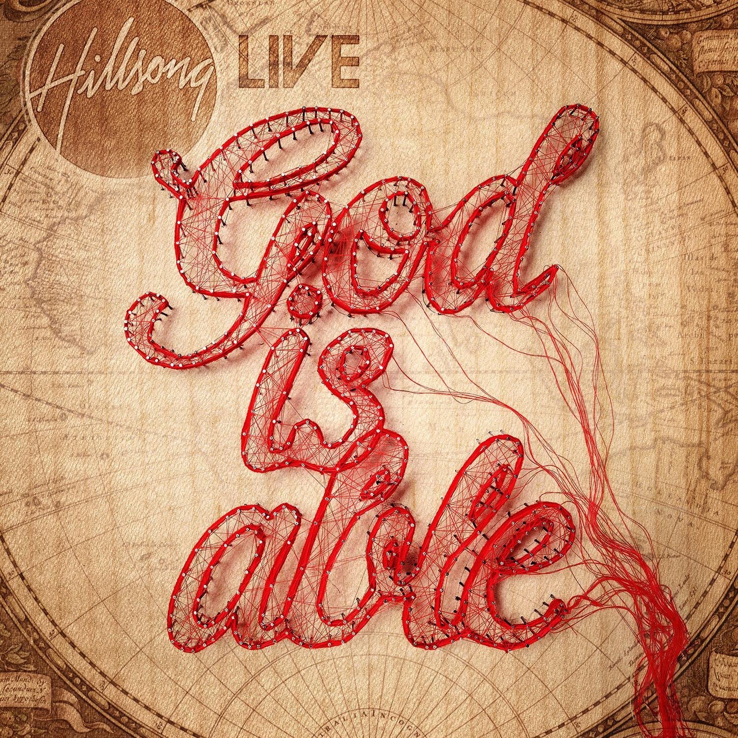
“God Is Able” by Hillsong Worship
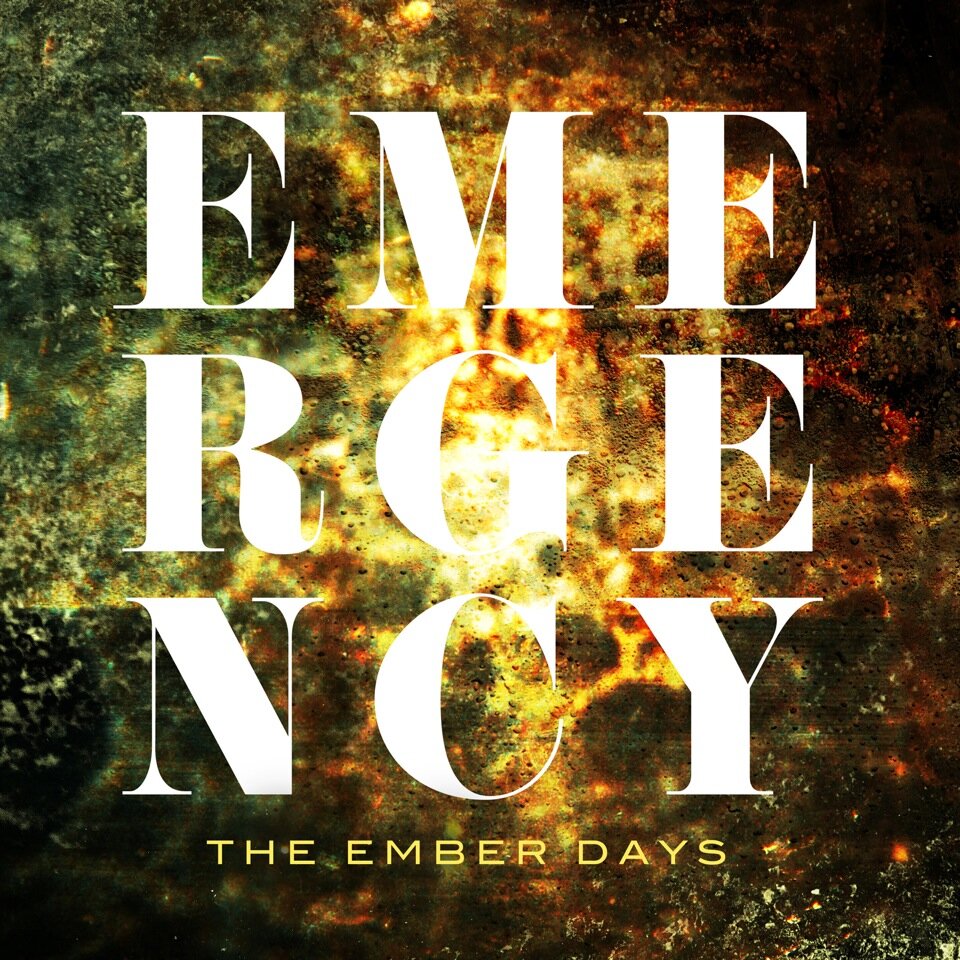
“Emergency” by The Ember Days
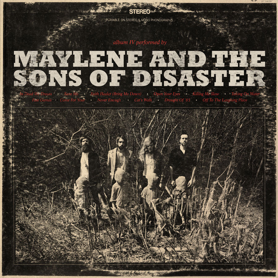
“IV” by Maylene and the Sons of Disaster
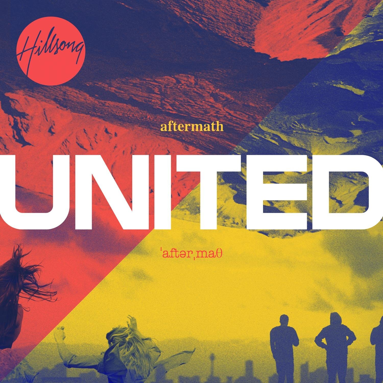
“Aftermath” by Hillsong United
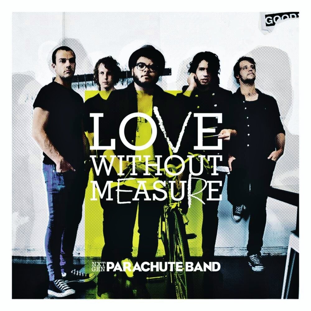
“Love Without Measure” by Parachute Band
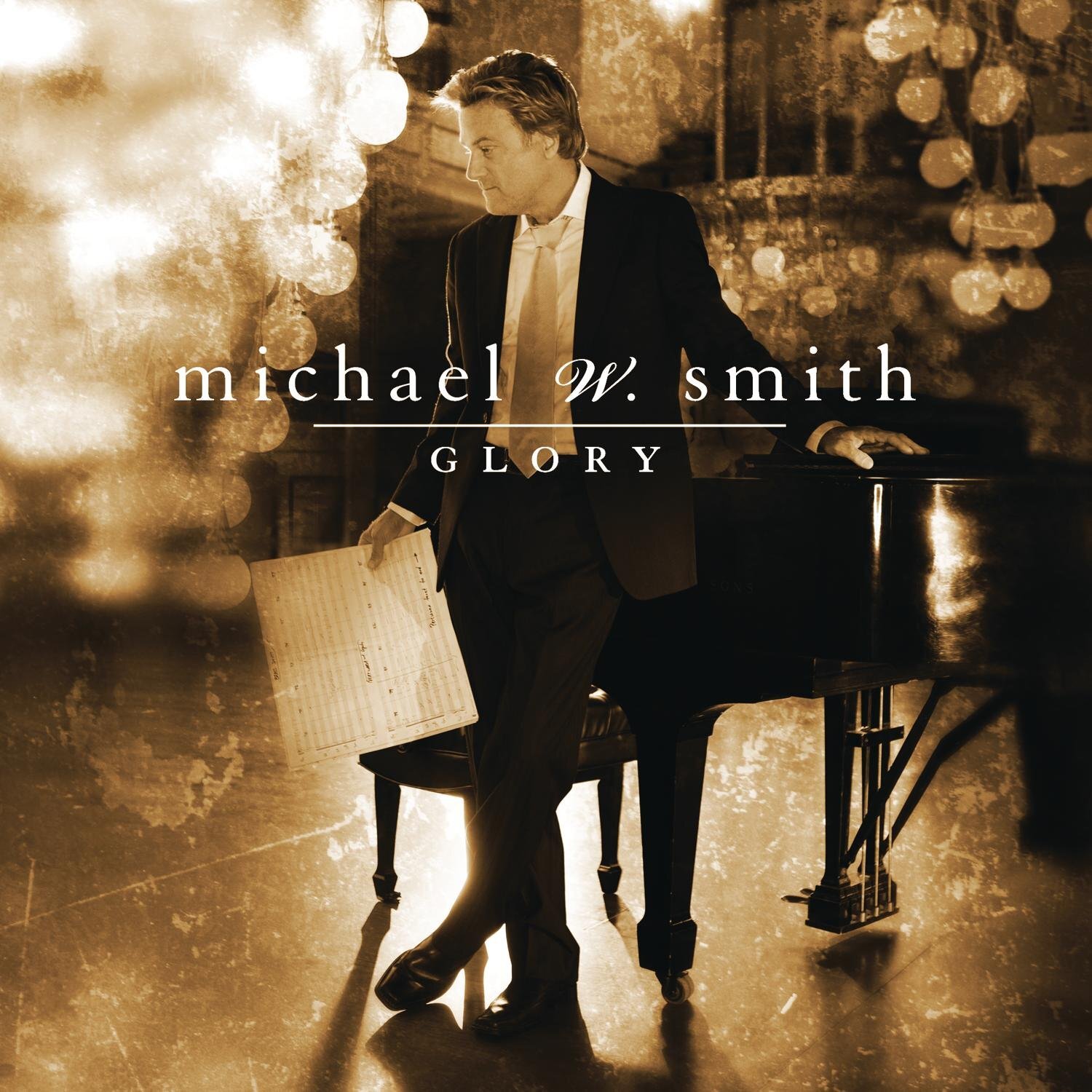
“Glory” by Michael W. Smith
Year 2 of the decade found that the best artwork comes in pairs! Two Christmas records made the list; with Michael W. Smith and Kutless showing us that white and gold will always work for a holiday release with their “Glory” and “This Is Christmas” records respectively. The worship records found their inspiration within the physical creative process with Hillsong’s “God Is Able” tangibly showing the scarlet thread of Scripture, while United and The Parachute Band took inspiration from the print process with halftone and duo-toned imagery and special edition packaging. Rebecca and Anthem Lights stayed consistent with their mainstream contemporaries by pairing type (bold and thin) with heavily bokeh infused photography, while The Ember Days and Maylene adopted another popular scene-kids-leftover — grunge backgrounds and serif type.
2011 WINNER: “Aftermath” by Hillsong United
Don’t hate me because they’ve taken first prize twice now, Hillsong and their team of creatives were very influential for CCM design culture in the early 2010s. Hillsong’s creative mark can’t be overstated and Aftermath was the main reason your church’s video announcements and bulletins in the early 2010s were filled with film grain, gradient maps and Times New Roman.
Creative Direction: Jay Argaet // Design: Nathan Johnson of Blacklist Studio
2012
“The Longing” by All Sons and Daughters
“For The Sake Of The World” by Bethel Music
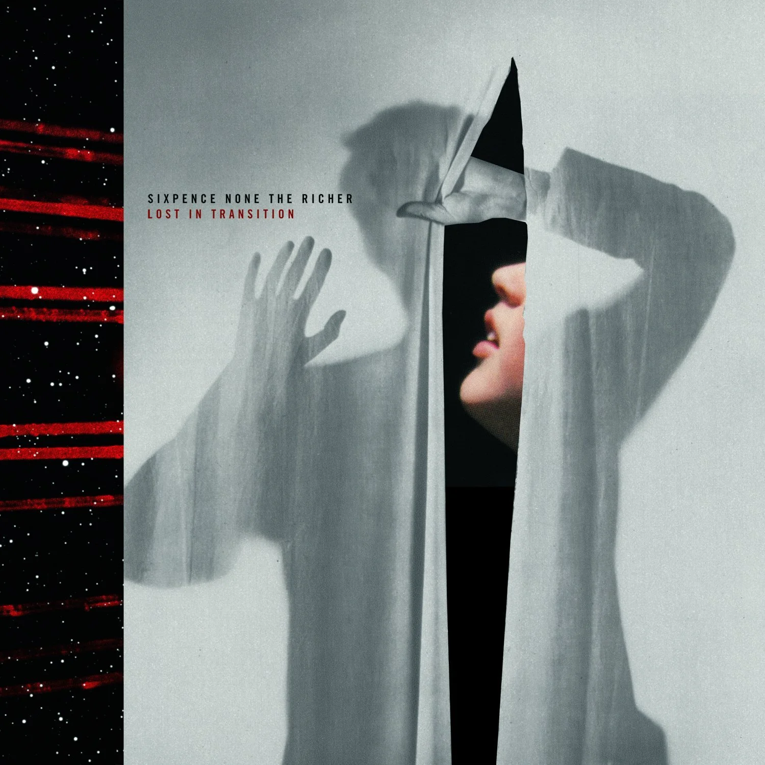
“Lost In Translation” by Sixpence None The Richer
“Matins:Vespers” by Parachute Band
“The Struggle” by Tenth Avenue North
“Center Of It All” by Desperation Band
“Live From New York” by Jesus Culture
“Miracle” by Third Day
“The Way Back Home” by Big Tent Revival
Unfazed by superstition and legendary end-of-the-world culture, CCM design in 2012 didn’t bend the knee to the futuristic and apocalyptic trends prevalent in the mainstream music industry. However it was the year of cream/grey album artwork with 6 of the year’s covers following suit. The worship world went crazy for shapes, with Sons and Daughters, Bethel, Jesus Culture, Desperation, and Parachute taking their design cues from the circle and triangle — the influence of Hillsong’s previous cover artwork noticed heavily here. Tenth Avenue and Tent Revival showed that hand-lettering and home-made graphics were here to stay, while ThirdDay and Sixpence took a clean, modern, photographic approach.
2012 WINNER: “Lost In Translation” by Sixpence None The Richer
15 years after becoming house-hold names both in song with “Kiss Me” and it’s artwork, Sixpence None The Richer gifted us this bold artwork, cleverly taking key elements from the album’s title and splicing them together in an oddly satisfying manner — no doubt pivotal in aiding the success of Sixpence’s musical comeback.
Design: Don Clark of Invisible Creature
2013
“Fading West” by Switchfoot
“How Mercy Looks From Here” by Amy Grant
“Live” by All Sons and Daughters
“Devotion” by Anberlin
“All The People Said Amen” by Matt Maher
“Inland” by Jars Of Clay
“Ø” by Underoath
“Zion” by Hillsong United
“IAMACEO” by Starflyer 59
“Fortunate Fall” by Audrey Assad
Whether intentional or not, 2013 carried heavy undertones both in music and artwork. There was a prevalence of grungier, deeper, and grittier visual narrative, manifested through muted color palettes, illustration and alternative artistic media. Physical art still found a home in 2013 with Assad and Jars of Clay’s efforts, complete with an impressive reflective art installation in rural New Zealand for Hillsong’s release. The obsession with hand-lettering was now waning as referenced with only two entires this year — Switchfoot and All Sons. Maher and Underoath kept the grunge and textured aesthetic alive and well, while ever the trendsetting Anberlin opted for a cover without a title. Not to be out-paced, Amy Grant and Starflyer 59 both produced artwork steeped in nostalgia — 59’s taking a tongue-in-cheek tone, with Grant’s reverie a classy, timeless approach to her 10-year comeback.
2013 WINNER: “Fortunate Fall” by Audrey Assad
Decidedly innovative and every bit delicate, this artwork is a simple but profound nod to the conceptual and prayerful tone of this release. Every song is stripped back, intimate and tinged with a sense of loss and questioning; qualities this artwork embraces and emulates with taste — all without a title; pure class. Not surprisingly, this album artwork won Benjamin top honors from Creative Quaterly at their annual awards.
Design: Benjamin Lee
2014
“Borderland” by John Mark McMillan
“The White Album” by Hillsong United
“Never Land” by Andy Mineo
“Brutal Romantic” by Brooke Fraser
“Rise” by Trip Lee
“Anomaly” by Lecrae
“Rivers In The Wasteland” by NEEDTOBREATHE
“Wake Up The Wonder” by Elevation Worship
“This Is All We Know” by Number One Gun
“Majestic” by Kari Jobe
2014 was the year of light, sepia-toned, muted cover art. Nearing the middle of the decade there was a definite shift in design with more artists pushing the envelope and raising the design bar to new heights. For the first time in the decade, Christian rap and hip-hop released on-point artwork with Lecrae, Mineo and Trip Lee taking top honors and breaking boundaries with their genre-bending efforts. Elevation and Number One Gun both created visuals around a glass cube, with Elevation’s going a step further with a furnace-infused masterpiece. Staying on-pace with their modern contemporaries, NEEDTOBREATHE released a detailed illustrative work, complete with a deliciously perfect handwritten title. Not to be out-paced, Hillsong opted for a white-on-white approach — another common-place trend in the industry — while McMillan and Fraser embraced similar narratives with physical art pieces; Fraser’s a self-moulded embrace — literally. Rounding out the year’s talent was Kari Jobe’s physical piece; an impressively detailed woodcarving, however held back by a confusingly plain portrait etching and oddly placed logo.
2014 WINNER: “Brutal Romantic” by Brooke Fraser
Much akin to the songstress herself, this cover artwork is strikingly beautiful. Classic, iconic, and clever to boot — it’s only upon careful inspection that the two statues at war are in fact Fraser herself — a subtle and profound nod to the title and subsequent lyrics of Psychosocial. Dreamed up by Fraser and executed by legendary Kiwi creative Campbell Hooper, this is a clever, modern masterpiece that put a stake in the ground affirming Fraser’s ability to deliver visually as well as sonically.
Design: Campbell Hooper
2015
“Neon Porch Extravaganza” by Crowder
“Valitus” by The Ember Days
“Brother” by The Brilliance
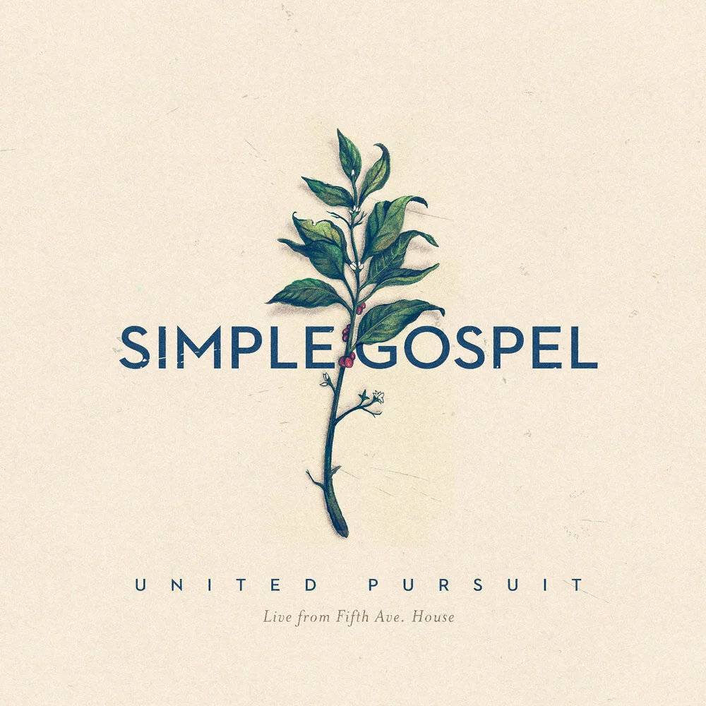
“Simple Gospel” by United Pursuit
“Empires” by Hillsong United
“Broken Temples DELUXE” by Kevin Max
“Open Heaven // River Wild” by Hillsong Worship
“Live At The Knight” by John Mark McMillan
“Hymns for Her” by Dave Barnes
At the center-point of the decade, CCM design had found it’s groove. With the exception of Crowder’s uniquely expressive (for all the right reasons) Neon Porch Extravaganza and Max’s decidedly futuristic-pop Broken Temples deluxe re-release, the year’s best were muted and smooth. CCM was well into its worship-centered transition and a global emphasis on the contemplative was setting in, as seen in the deep, sometimes-nostalgic yet emotive art for Hillsong, McMillan and Pursuit. Finishing off the list with single-focus, side-profile, boldly lit projects from newcomers Barnes and Brilliance and the farewell project from NZ-based worship outfit Ember Days.
2015 WINNER: “Neon Porch Extravaganza” by Crowder
Design that doesn’t miss a beat while being a mid-decade trendsetter, this artwork for Crowder’s EP is a triumph. Bold, perfectly odd, with a quirky come-back-for-more appeal that only grows with time, this artwork was ahead of it’s time; just ask any designer from 2018/19 — badly clear-cut images with random color and no type — we’re here for it, 5 years on.
Design: Leighton Ching
2016
“Let It Echo” by Jesus Culture
“Where The Light Shines Through” by Switchfoot
“Behold” by Lauren Daigle
“Hard Love” by NEEDTOBREATHE
“Becoming Who We Are” by Kings Kaleidoscope
“Glory & Wonder” by Mosaic MSC
“The Eternal Son” by Rivers & Robots
“Housefires III” by Housefires
“Poets and Saints” by All Sons and Daughters
Overtaking their worship friends, 2016 saw a strong batch of artwork for the pop/alternative CCM crew. For the first time it seemed that design trends were anything but predictable with the only similarities on the board found with Jesus Culture and Rivers & Robots collaged artwork. Housefires were the only brand still using hand-lettering, though it’s tasteful execution keeps them on-trend. NEEDTOBREATHE and Mosaic opted for simple type with Mosaic taking their cue from mainstream pop, producing an artistically savvy worship release. Switchfoot did away with their iconic early 00s typewriter logo and fully embraced a hand done approach, while Kings did away with type altogether offering a superb flat-lay effort — a tasteful approach to a design style usually relegated to Instagram. History was brought forward with the last two entries; Daigle with an on-point 50s offering and Daughters with their renaissance revival.
2016 WINNER: “Glory & Wonder” by Mosaic MSC
Edging out their contemporaries, Mosaic MSC arrived at the design table with strength and both genre-defying simplicity and prowess. This groundbreaking artwork challenged the norms of best-practice for a worship record; fitting for a church located amidst the Walk of Fame on the end of Hollywood Boulevard. A new level of edge and mainstream compatibility was unleashed with these new-comers.
Design: Tess Roy
2017
“On My Side” by Kim Walker-Smith
“Real Life” by Aaron Sprinkle
“The Garden” by Kari Jobe
“Build Your Kingdom Here: The Mixtape” by Rend Collective
“Worthy Of Your Name” by Passion
“Wonder” by Hillsong United
“Mercury & Lightning” by John Mark McMillan
“Love Has A Name” by Jesus Culture
“The Peace Project” by Hillsong Worship
Hot on the heels of the previous year’s “Glory and Wonder” by Mosaic MSC, the worship and alternative world jumped on the bold-and-different design train. Hillsong, McMillan, Walker, Jesus Culture and Passion all released artwork with a decidedly 80s/90s flair. Most notable is Passion and Hillsong’s choice to almost hide their usually front-and-center logos on their respective releases. Sprinkle, Walker and Jobe are the only ones to use portrait photography — Sprinkle’s iconic high-school-yearbook-photo making it’s cover debut. Collective and Jobe both opted for literal interpretation in their artwork, while Hillsong Worship, on-point as always, snuck into the end of 2017 with an almost Insta cover; perfect fodder for the art-loving-millennial-blogger-feed-conscious type.
2017 WINNER: “Wonder” by Hillsong United
A concept album, with 150+ documented alternate cover options, this artwork stands as a testament to the nail-biting, sometimes excruciating process of the creative solution. Not only was the music a big win for the local church outfit (So Will I), the artwork deftly captures the essence of wonder; color, confidence and an element of uncertainty. The reasoning behind this cover remains somewhat elusive, leaving us to marvel. Well played Hillsong. Your move, CCM.
Design: Nathan Cahyadi
2018
“Let The Trap Say Amen” by Lecrae, Zaytoven
“Look Up Child” by Lauren Daigle
“Changed” by Sanctus Real
“Good News” by Rend Collective
“Stir A Passion” by Worship Central
“Moments II” by UPPERROOM
“Reckless Love” by Cory Asbury
“Pat Barrett” by Pat Barrett
“There Is More” by Hillsong Worship
“Hallelujah Here Below” by Elevation Worship
“Discovery” by Rivers & Robots
“The Things We Were Afraid To Say” by Tenth Avenue North
“Living With A Fire” by Jesus Culture
From black and white portraits to a box of matches, 2018 was about as unpredictable as you’d expect. Nearing the end of the decade, CCM designers were consistently pushing the boundaries of creativity and in some cases these covers heaped controversy. Asbury’s effort was one of the most anticipated and hotly debated covers of the year, with the artwork (a blurred and darkened father/son embrace) only adding fuel to the already Reckless fire. Love was second in controversy only to Hillsong’s There Is More; the only cover to have an intellectual property lawsuit filed against it for claims of blatant copy.
Controversy aside, JC, Elevation, Tenth Avenue and Robots all joined the list with bold colors; Elevation taking the cake with detailed illustration, rivaling the impeccable album production. Daigle and Barrett looked the other way, literally, as both parties opted for portraits, while Collective returned to form with a nostalgic band photo. Upperroom, Real, Lecrae and Central followed suit with photo-driven cover art unrelated to their respective titles; with Upperroom using literal interpretation with prowess.
2018 WINNER: “Moments II” by UPPERROOM
A cover equally clever, simple and obvious, swooped in mid-year to take this year’s design crown. Frustratingly obvious at first and then astutely smart, Moments II might not’ve opened the weird-and-wacky door, but it certainly ran through screaming. The current design trend of 2000s mayhem and weirdness owes some level of credibility to the fast-paced, witty and talented team at Upperroom; their ability to jump on board with a trend, turn around and just as quickly move on, left the rest of us barely through the proverbial door. Is this also the first worship album cover with scantily-clad bathers front and center?
Design: UPPERROOM Creative
2019
“Never Fold” by Tedashii
“Covered” by Mack Brock
“Vacancy” by Will Reagan
“Work In Progress” by Andy Mineo
“Moments III: COLOR” by UPPERROOM
“Zeal” by Kings Kaleidoscope
“Young In My Head” by Starflyer 59
“Unstoppable God” by Sanctus Real
“Awake” by Hillsong Worship
“Out Of Body” by Apollo LTD
“Jesus Is King” by Kanye West
“Fear” by Citizens
“Vulnerability” by Strahan
If 2018 was the bar by which unexpected oddities and weirdness was set, 2019 took the bar and deconstructed it; Kanye style. Of the 13 covers listed here, only 2 have anything to do directly with their respective titles. 2019 was the year of art for art’s sake and boy, did the art deliver. New-comer West and old favorites Citizens chose a very literal physical approach to their visuals, with a less edgy version credited to Brock. Sanctus and Apollo both offered collage as their art form, with Tedashii the only artist to feature a photo portrait. Reagan, Hillsong, Upperroom and Kings all brought varying levels of color deconstruction to their projects; Reagan’s Vacancy juiced-lemon taking the prize for most deconstructed. Mineo featured a work-in-progress portrait painting for his aptly titled “WIP” album — deep, while folk artist Strahan entered with a string-portrait; also a work-in-progress.
2019 WINNER: “Vacancy” by Will Reagan
Minimalistic, witty and deconstructed, Reagan’s artwork is an iconic creation that both defines the generation responsible for it’s genius, whilst also challenging the design-status-quo of an entire genre. Not since the 90s, when worship leader’s faces were first featured on artwork (what scandal, isn’t it all about God), has there been such a quietly bold disruption our sacred genre, that and Kanye. Deftly brilliant with applaudable prowess, Vacancy astutely sums up the 2010s — an era that started out cookie-cutter and ended up anything but — kitchen utensils somehow still in hand.


